It all started with a thought, is our image starting to look a bit dated?
We'd seen many of our clients re-branding moving their image forward simplifying and really bringing strong imagery to their respective brands.
So in 2020 we believe it's time we should too.
We've been using our crossover two circle logo for a long time and we have become very fond of it, but it's time to change.
The reasons why we have taken these steps is the dated look of our previous logo plus our design team liked to tweak it, some just using the centre circle, some just using the letters, tweaking the colours etc so we decided let's get ourselves a modern and forwarding thinking image.
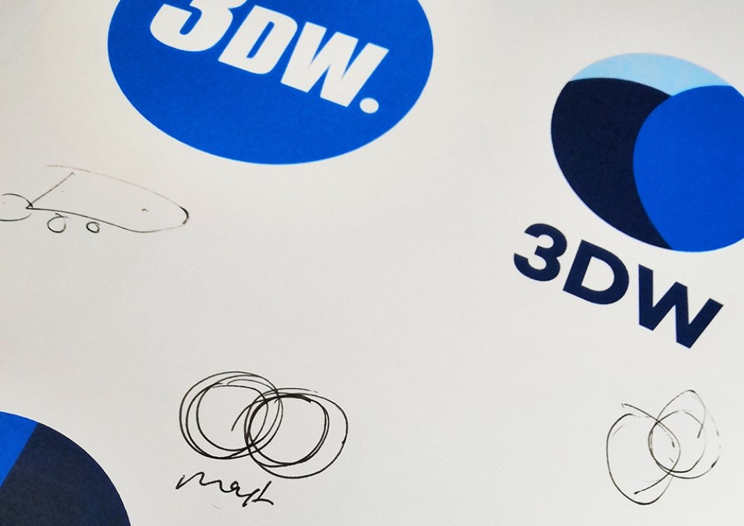
Kieran and Max from our team set to work with the brief of designing a new company image, they took the old logo dissected it, looked at the colours, decided what was important in our company image. Was it the crossover circles? did they need aligning? was it the colours that needed tweaking? should we just strip it right back and keep things clean?
As the design process progressed they worked away with updated colours, deciding to lighten the blue colours and retaining the navy. They left designs that didn't work on the drawing board i'll be honest here one of the designs looked like a popular delivery company. They wondered about changing the shape of the logo, should it be square? should it be 3D? should we totally ditch shapes and just use basic letters.
Designs that didn't make the cut
A breakthrough
After a period of time and much deliberation we finally came up with the final design for presentation to Andy and he endorsed the vision fully. Adopting a new fresh look and bold image that will be used across our online presence and all company documents.
Our new logo and colour palette offer something fresh to our company image going forward, clean and uncomplicated with a strong feeling of continuity.
We'll have an interview with Andy who will give his own personal feelings on why we've rebranded.
#future3DW
Thank you for taking the time to read this